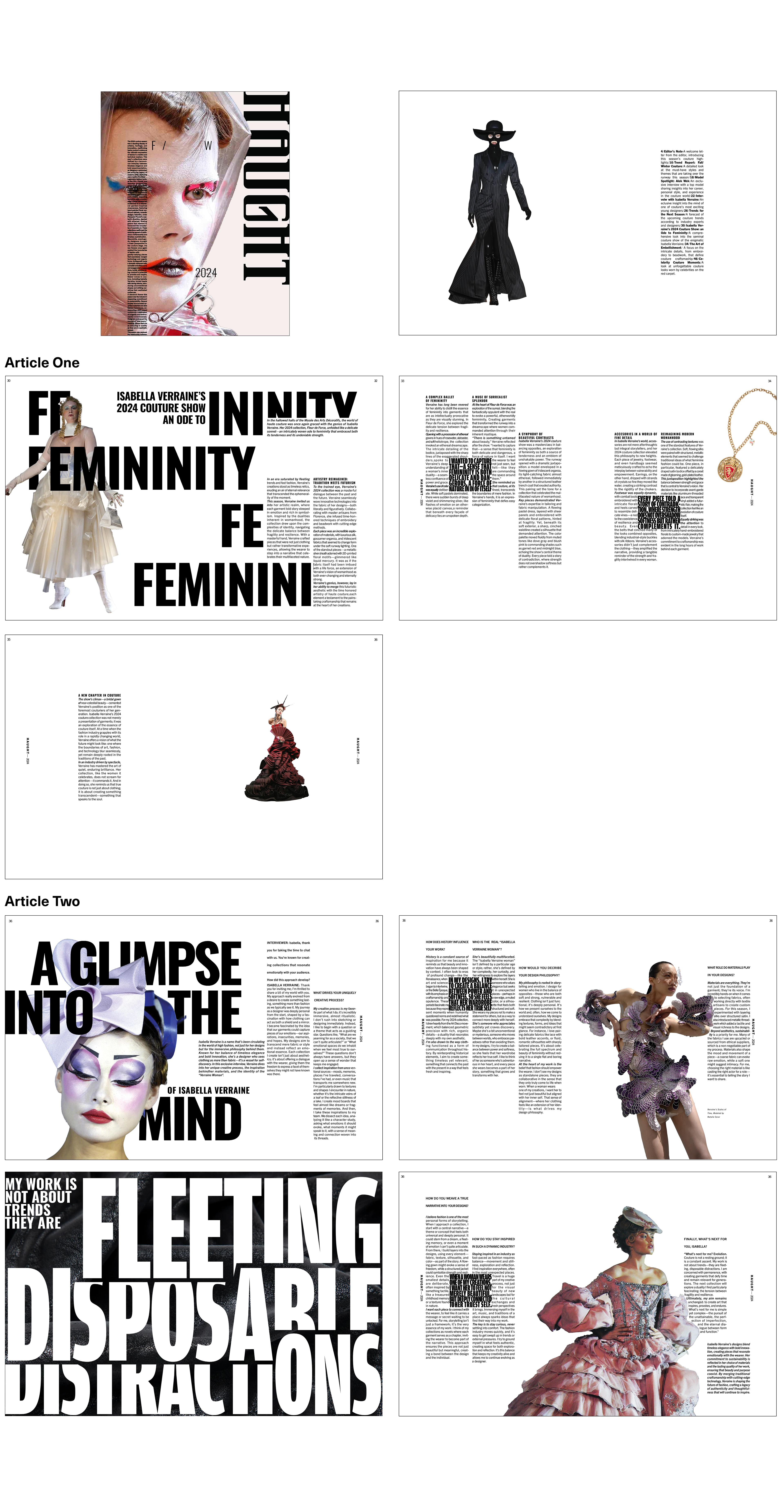
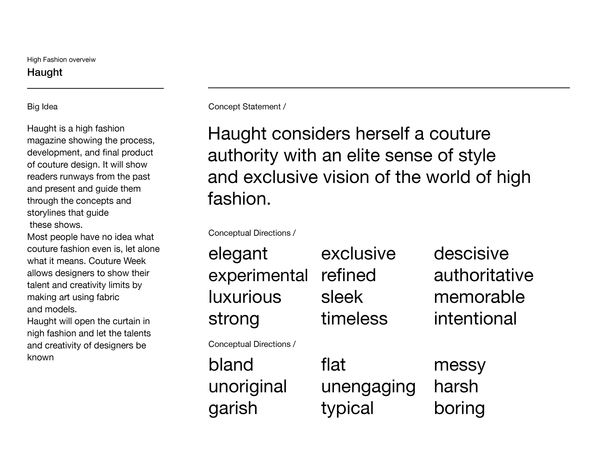
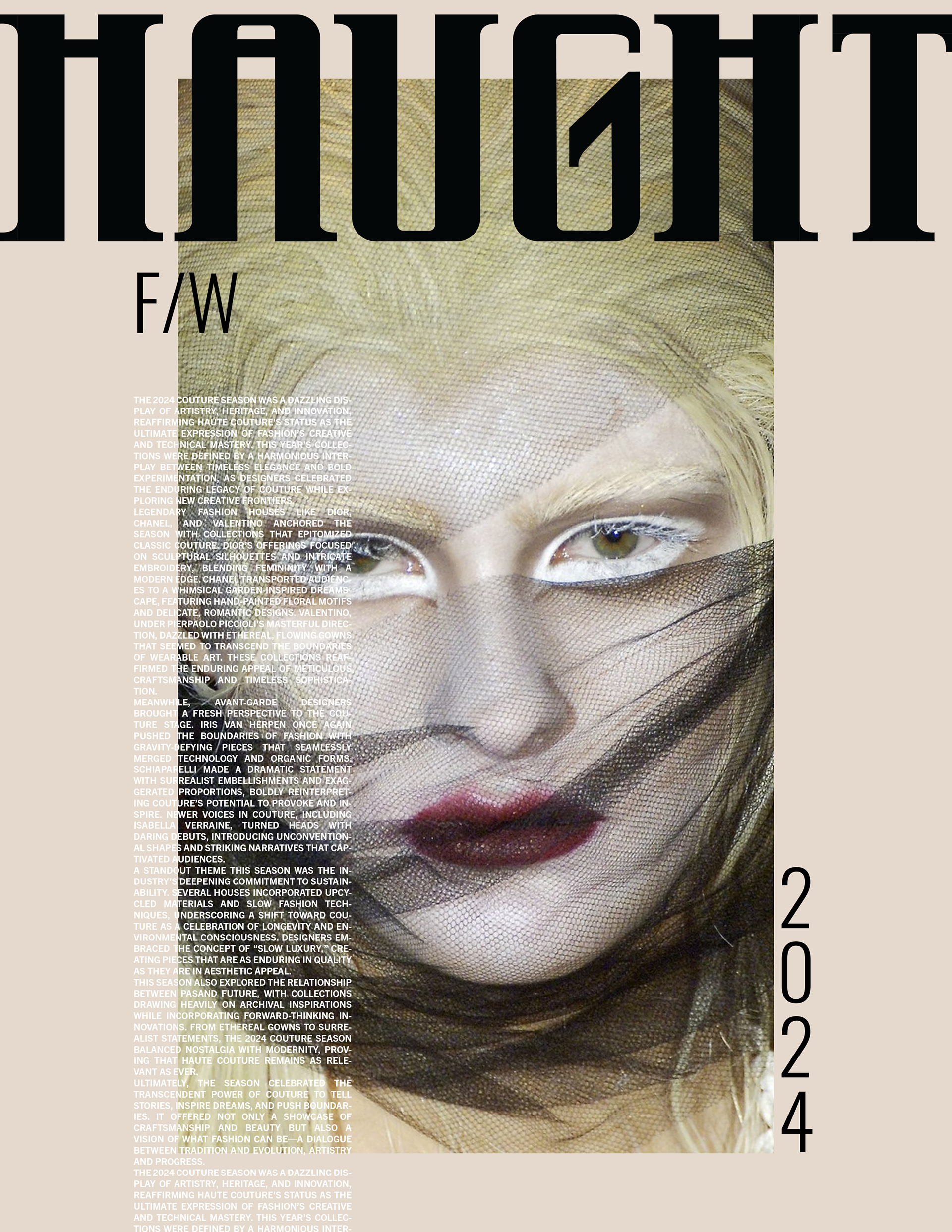
HAUGHT is a concept for a magazine about couture fashion. The focus of this project was defining and expressing a definitive brand identity and message. The concept of the brand of HAUGHT is Elegant, authoritative, strong, decisive, and avant-garde. My goal was to clearly communicate these ideas through a unique wordmark and page layout.
Brand Building
Defining the focus and personality of HAUGHT
Wordmark Development
Finding and modifying an existing typeface, I decided on Acumin Variable by XXXX, a gothic
sans-serif with many applications. I went through many ideations and iterations finding the perfect vibe for HAUGHT. I knew I wanted to focus on the elegance, strength, and severity of my brand identity, and I explored these aspects through contrast, width, and the fundamentals of the letterforms such as crossbars and bowls.
sans-serif with many applications. I went through many ideations and iterations finding the perfect vibe for HAUGHT. I knew I wanted to focus on the elegance, strength, and severity of my brand identity, and I explored these aspects through contrast, width, and the fundamentals of the letterforms such as crossbars and bowls.
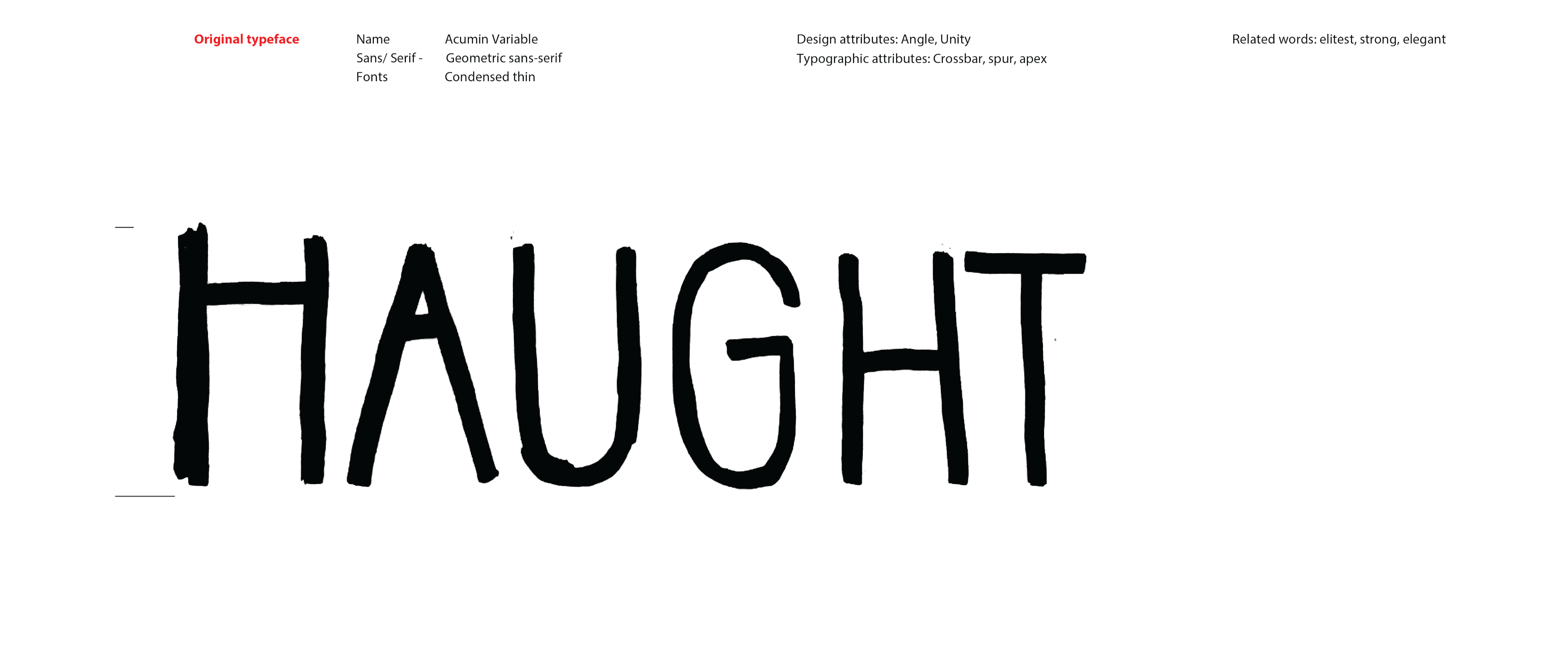
Final Wordmark

MAGAZINE
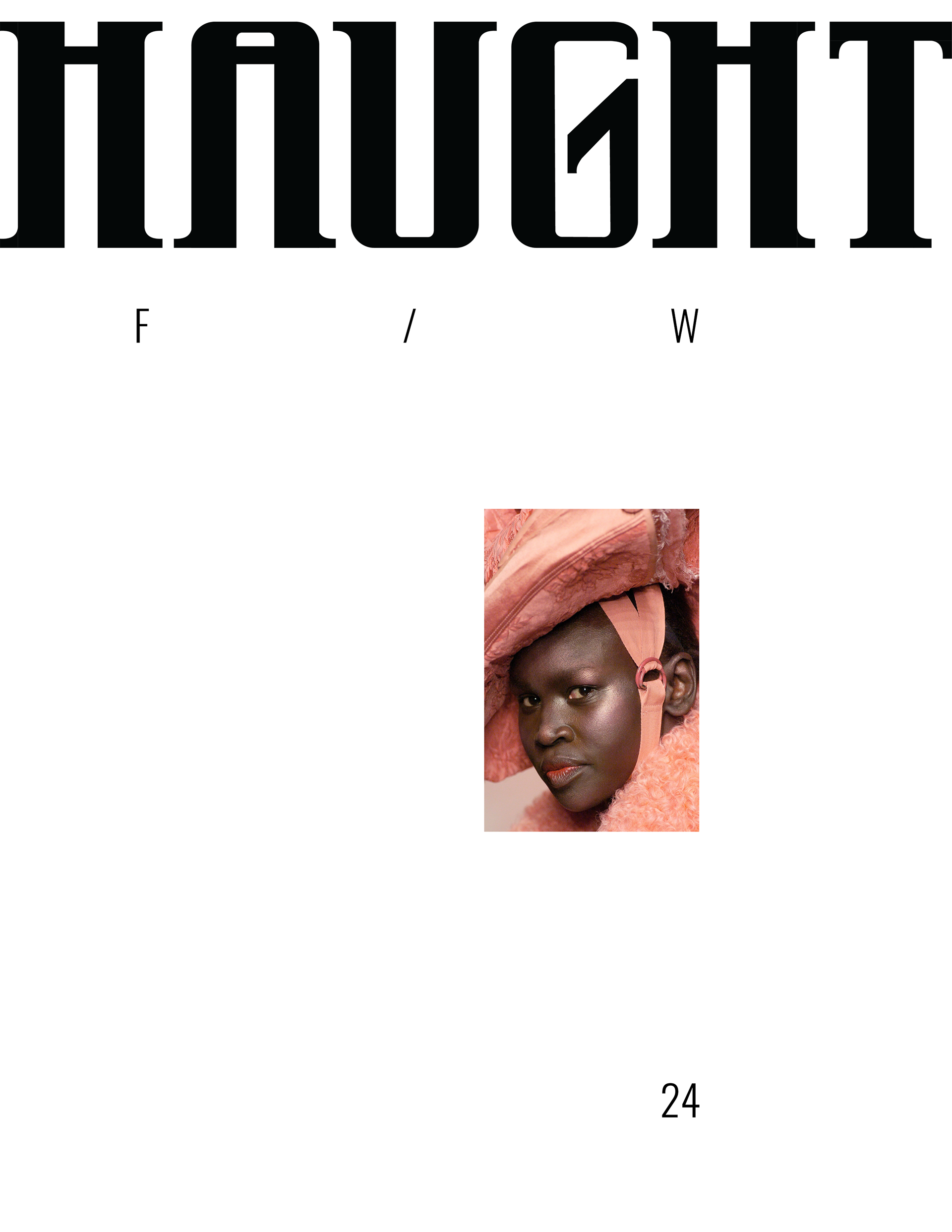
Beginning Layouts
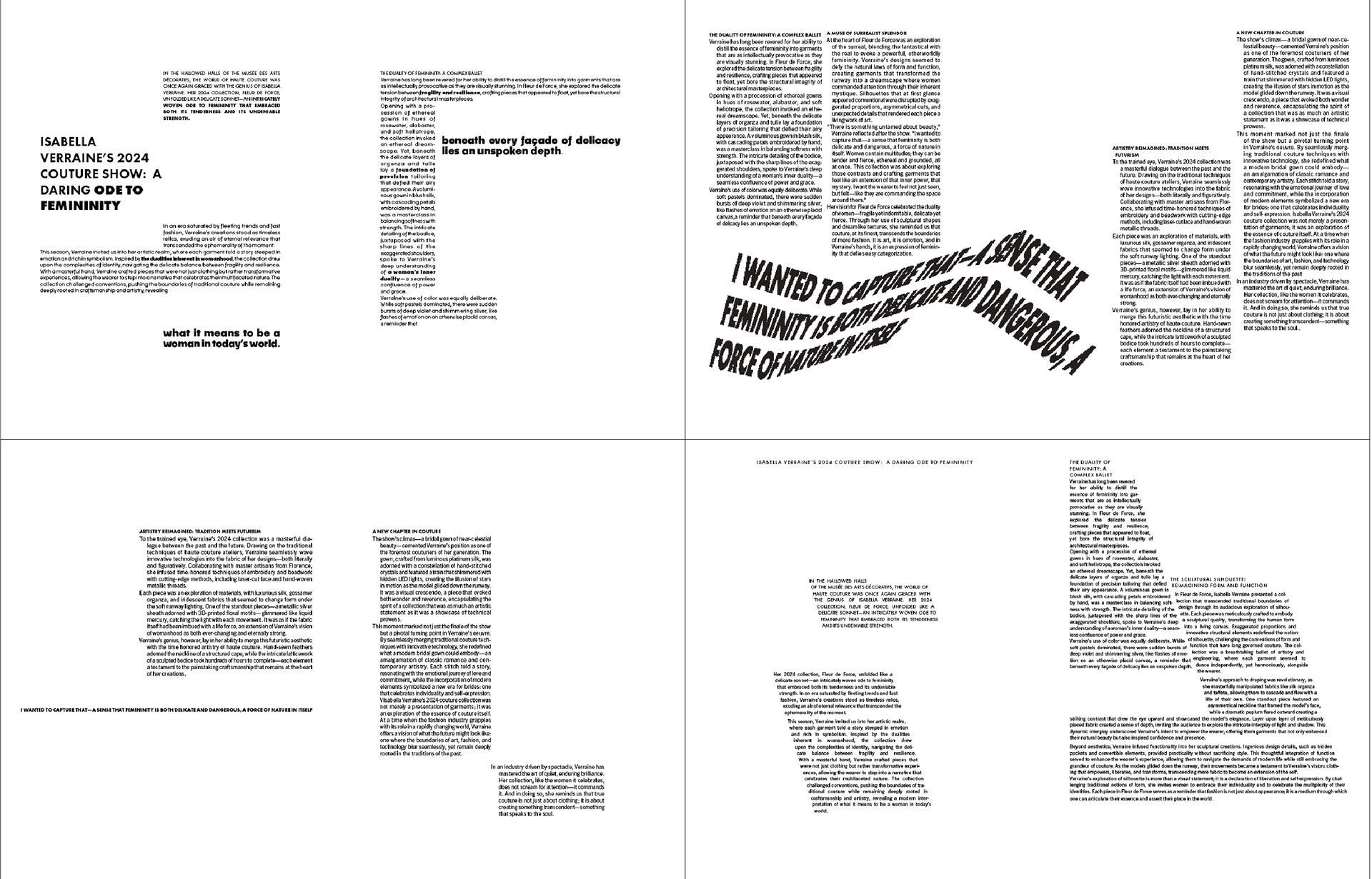
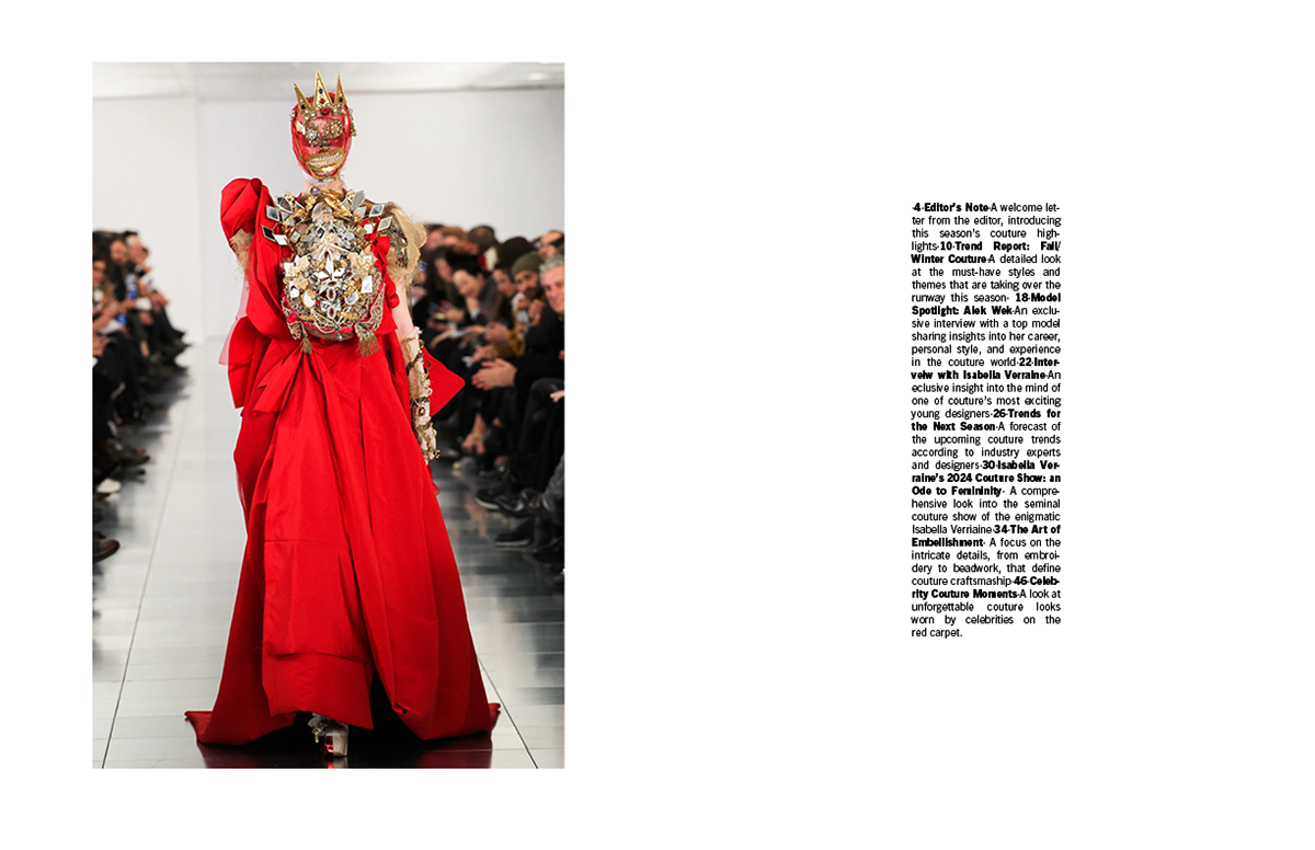
Experimenting with the first article of the magazine, a feature article on an imaginary couture show by the fake designer Isabella Moraine. The show's concept focused on the duality of femininity, attempting to balance strength and gentleness. This matched well with the identity of my magazine as elegant yet authoritative.
Paragraph articulations influence the mood and readability of a text, so it is important to employ the right one.
GRAPHIC STANDARDS
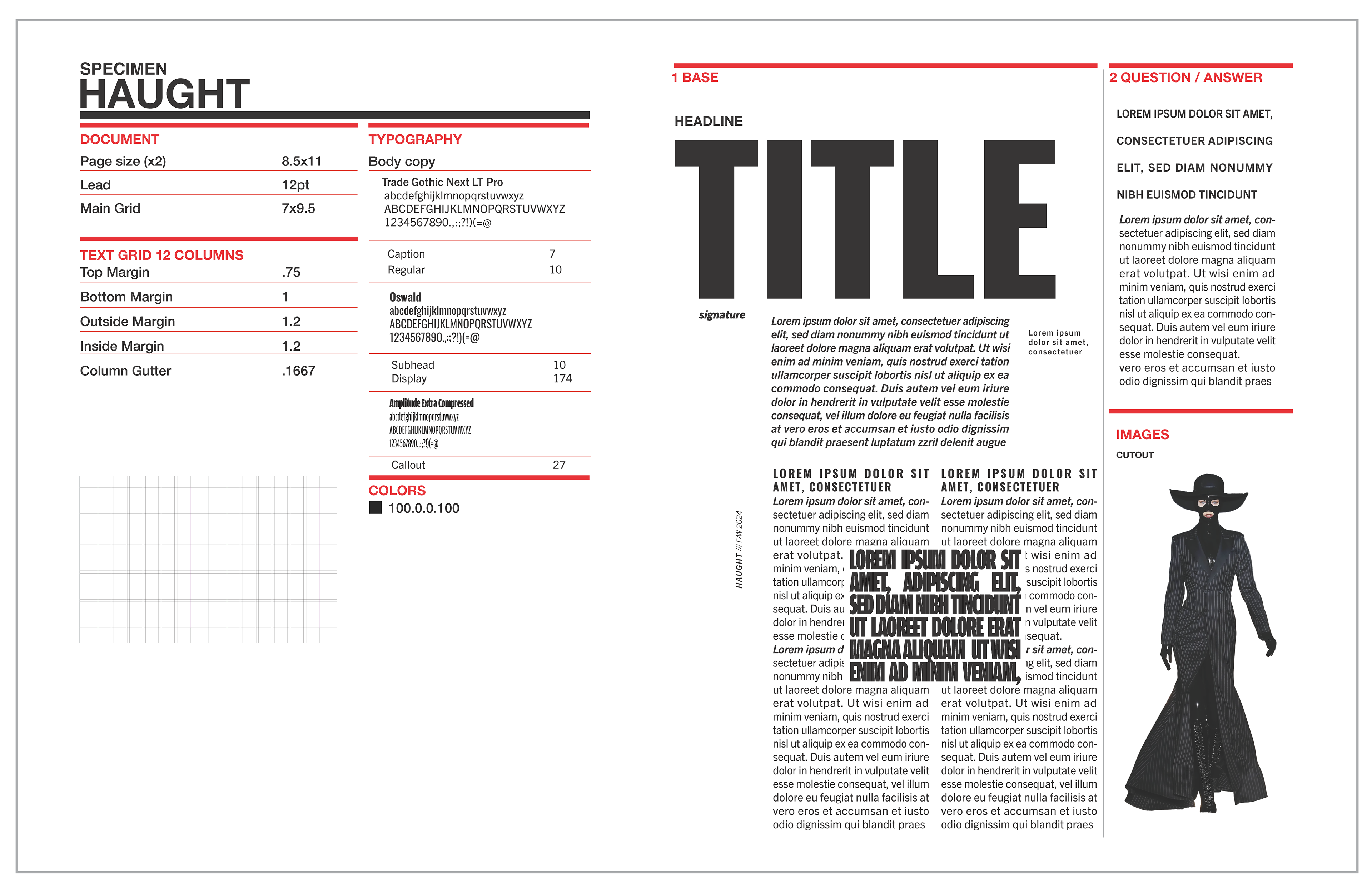
Text and Image
Exploring paragraph articulations, margin and grid sizes, and the amount of content on the page
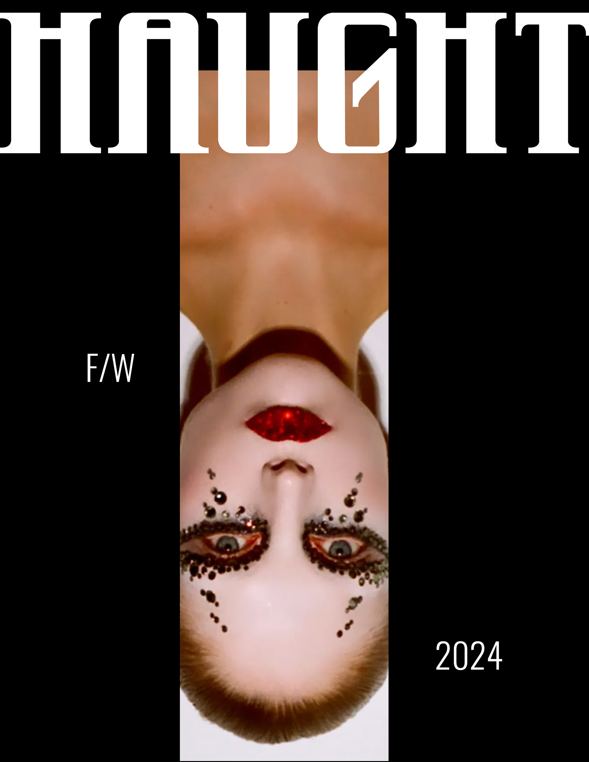
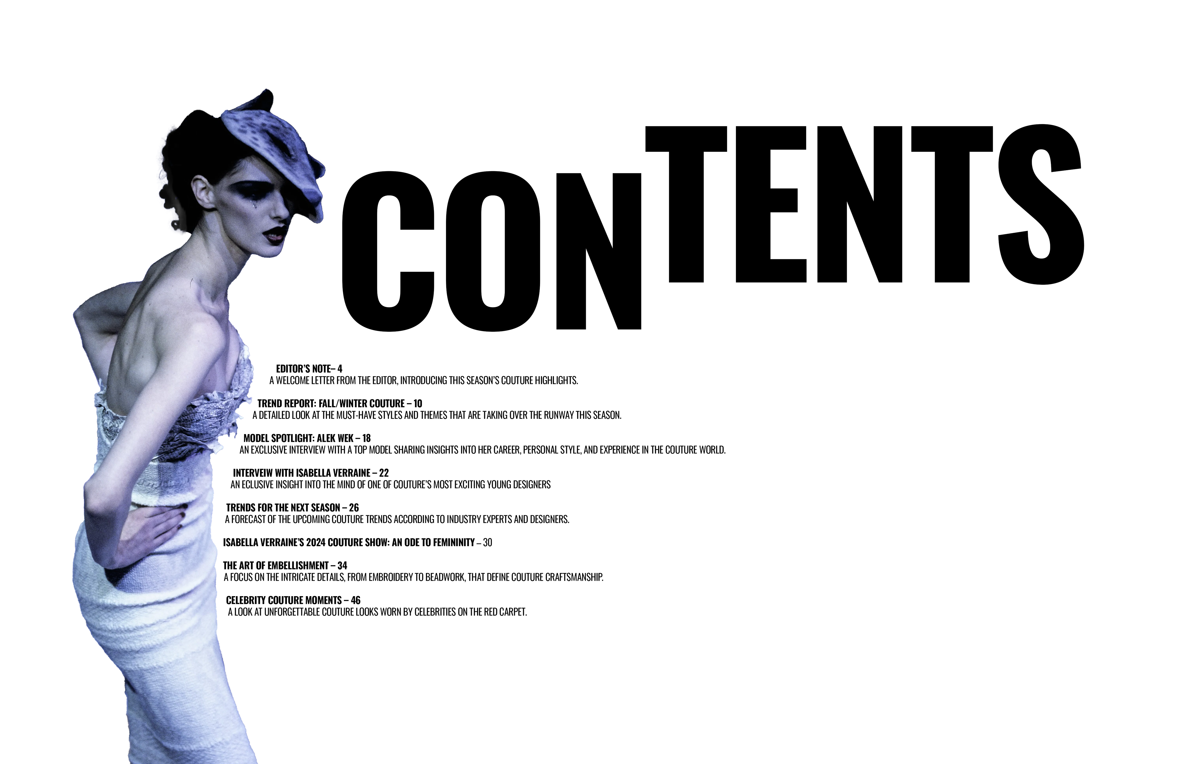
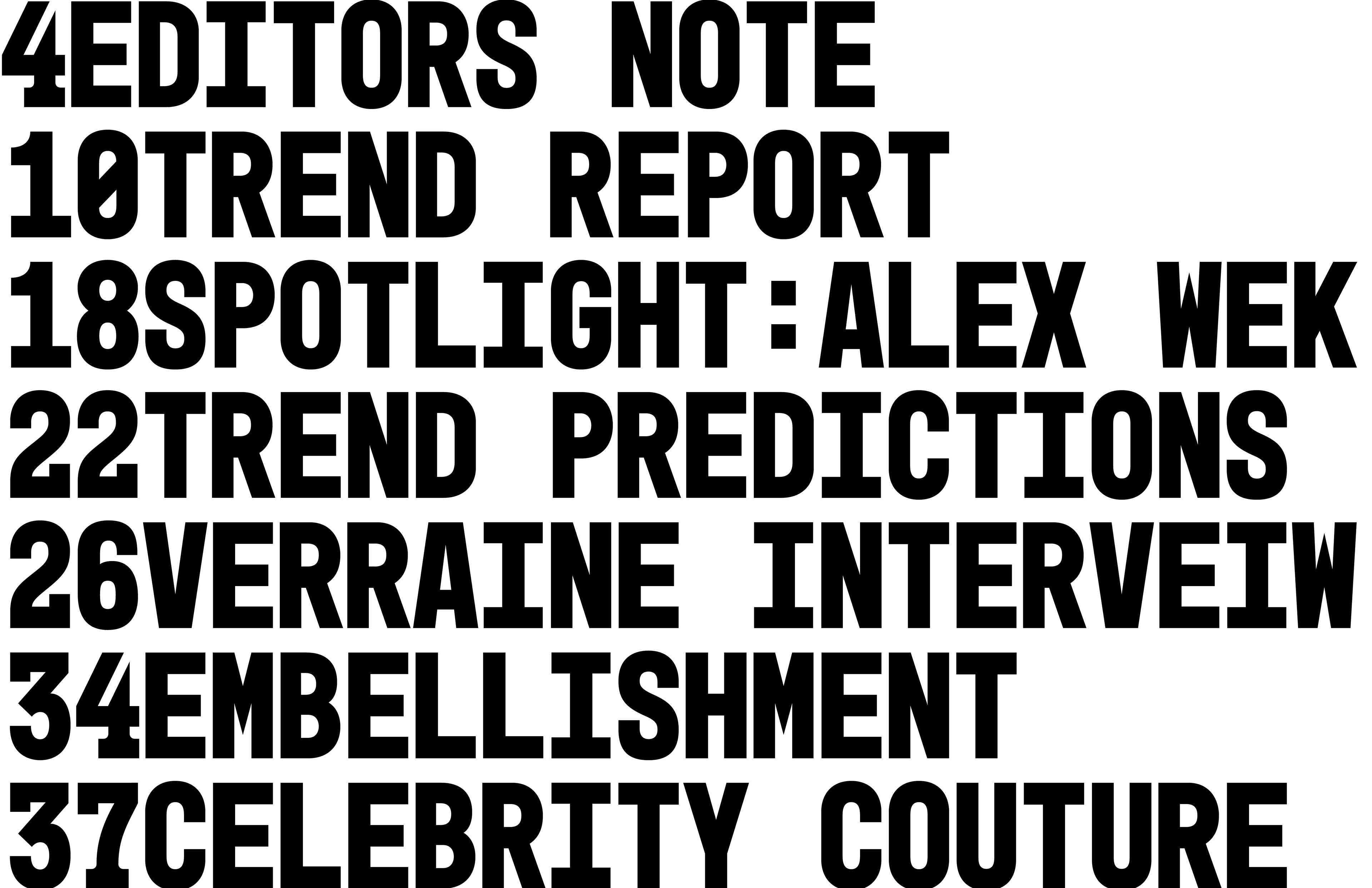
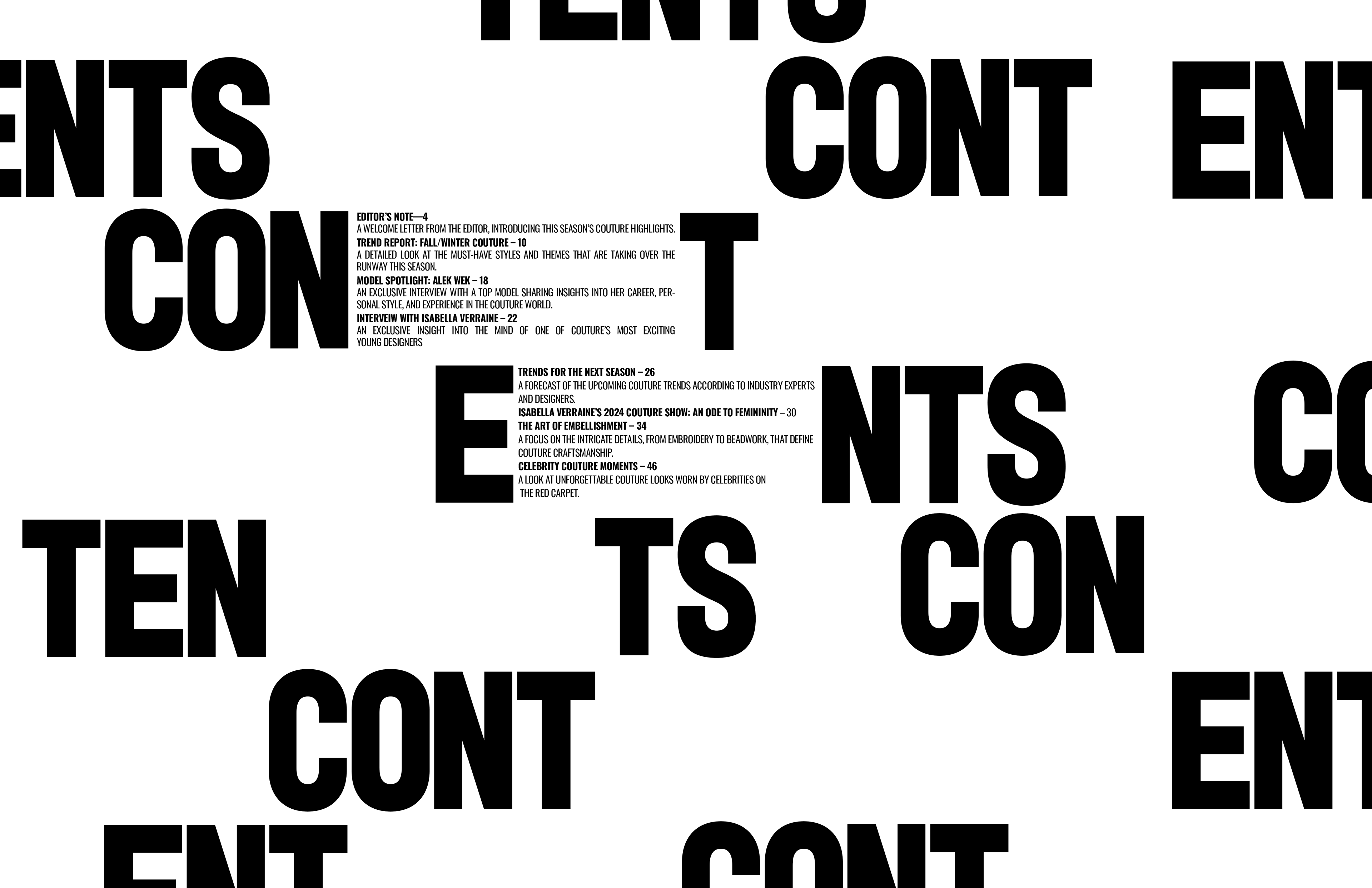
Cover and Contents
After exploring my article spreads, I began experimenting with my cover and table of contents.
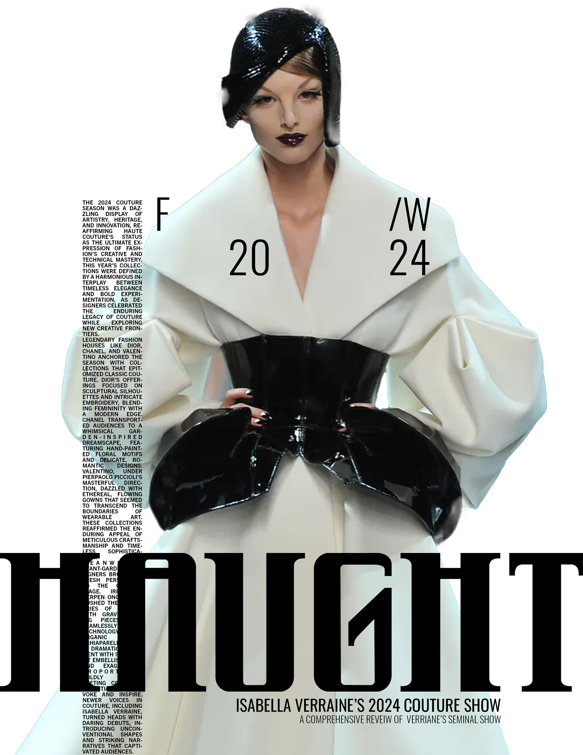
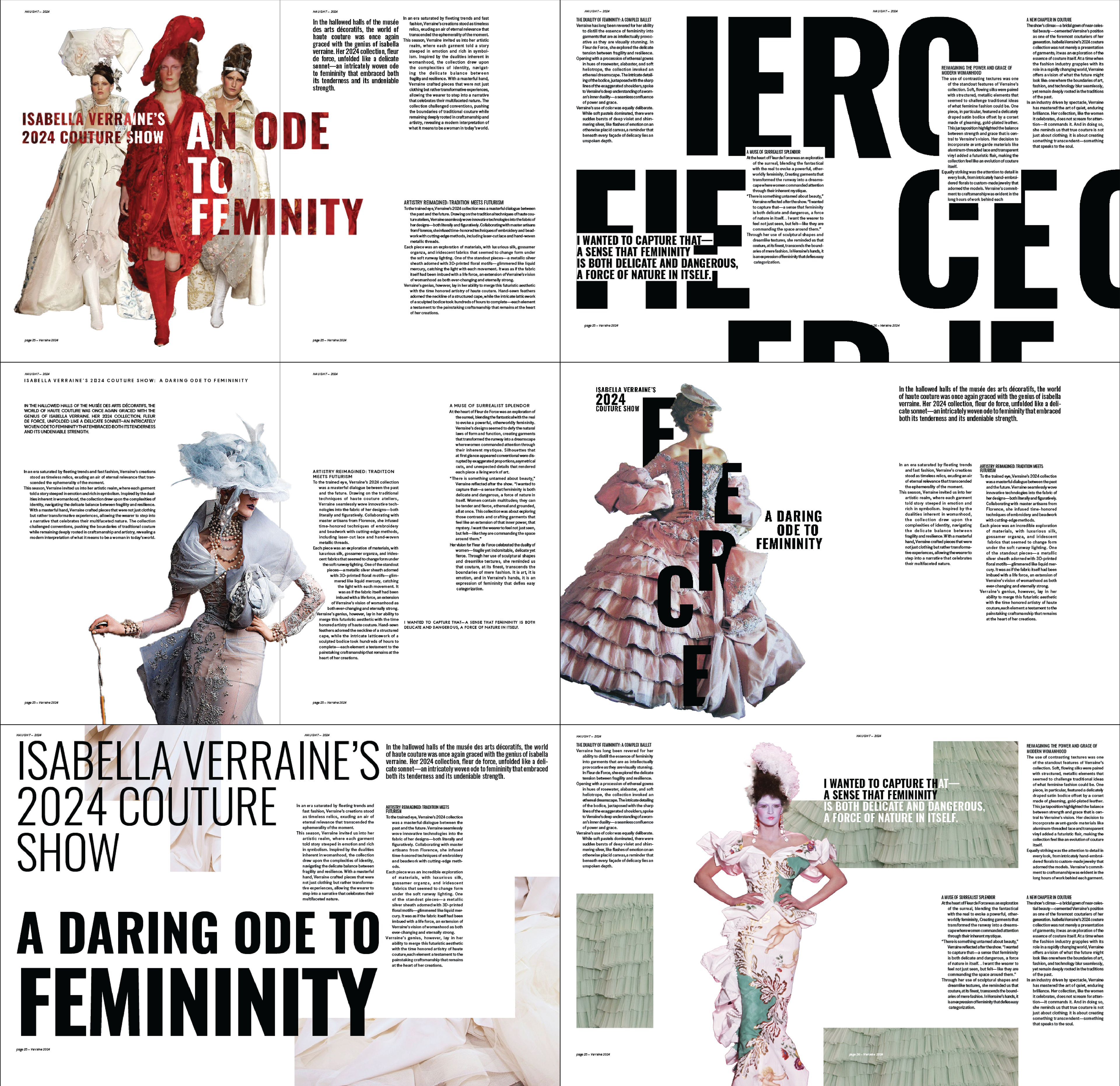
Final
The final results showed the beauty and strength I first imagined when conceptualizing HAUGHT. They were elegant and strong, yet retained a sense of playfulness. Four planned spreads turned into nine and allowed me to express my full vision